Here at Novell we’re working on a new reporting tool. It’s a web-based application with GWT and a little JQuery on the client side. On the server side, the tool uses Java servlets. It also uses REST for all communication between the browser and the server.
We’re investing in a new code base and we want it to grow into the future. Our framework must be maintainable and extensible. It also needs to welcome new programmers. In this article I’ll show you some of the styling guidelines we developed to make that happen. I’ll also show you the general CSS layout of the reporting tool and how we let customers customize that layout.
Our first step was creating a set of rules that made sure our lofty goals became reality.
Rule 1. Simple HTML
GWT is well-known for generating complex HTML. Seemingly simple widgets often generate many layers of extra tags. Generated code is always more complex than what you could write by hand. This complex HTML causes slow pages, complex CSS, and makes it difficult to style the UI. It also makes it very difficult for customers and partners to understand the DOM structure and customize the CSS.
Creating simple HTML from GWT requires some upfront planning, a willingness to create custom GWT widgets, and a tags first approach to GWT. It also requires a decent knowledge of CSS.
Rule 2. All layout in CSS
Making your HTML tags simple keeps your CSS simple. It also encourages you to push all layout logic into the CSS. This is important because CSS layout is much more powerful than HTML layout and separating layout and implementation keeps the code cleaner. Putting all the layout into CSS also makes it easy to customize the layout without recompiling.
Rule 3. No FlexTable
FlexTable is a common GWT class for simple form layout. It makes prototypes easy and gets your UI up and running fast. It’s also a major GWT anti-pattern.
FlexTable generates table tags for form layout. Tables work well for tabular data, but I’d rather use the right tool for the job. Tables are very limited in their layout functionality, difficult to customize, and notoriously hard to maintain.
We are committed to simple, accessible forms in the reporting tool and that means no FlexTable.
Rule 4. All images in CSS
The GWT compiler automatically creates CSS sprites. It stitches different images together at compile time and uses JavaScript to generate inline CSS that references those images. CSS sprites make the application load faster by eliminating extraneous HTTP requests. Abandoning CSS sprite generation was tricky, but we decided that customizing the reporting tool without recompiling is important.
That lead us to rule number four, all images should be referenced from CSS. That doesn’t preclude us from creating CSS sprites with external tools, but it means we can’t have the GWT compiler do it for us. This way, customers can completely change the colors, branding, and layout with just the CSS.
We also added an easy way to customize our CSS without editing our WAR file. I’ll get to that later in this article.
Rule 5. Love the grid
Graphic designers and typographers have use grids to make their designs clean and consistent for hundreds of years. They’ve become very popular on the web in the last few years. Grids are everywhere.
The reporting tool is based on a fluid grid. That means the grid changes size depending on the size of the browser window. Every browser is the perfect size for the reporting tool.
155 with 20 forever
Our fluid grid uses 155-pixel-wide columns with 20 pixels of space in between. These columns start on the left side of the page and continue forever toward the right side. Since our UI resizes, the column model breaks down a little bit on the right side of larger screens.
When we add new elements to the UI we can use the grid to align them into columns. For example, the navigation bar will line up with the footer text. The grid gives the entire page layout a sense of purpose.
Grids also make our application easier to use. The different pages in the application all feel familiar to the user. When they switch to a new screen they spend less time trying to understand it and more time doing real work.
Vertical rhythm
The grid handles the horizontal columns of our layout, now let’s look at the rows. Our rows use a pattern of 12/14. That means we are using a 12 pixel font size with a 14 pixel line height. These numbers define the vertical rhythm of our UI.
The rhythm provides a guide to make all of our text and other elements line up. For example, if you add a title using a 48 pixel font size then you make that line height 56 pixels tall because 14 times 4 makes 56. Your line height should always be an integer multiple of 14.

When you add an image or a form control you adjust the spacing around it so that the total height of the element is an even multiple of 14. The separator in our navigation bar is a good example.

The text in the navigation bar is 18 pixels tall so the line height is 28 pixels. We’re also using a separator image that is 15 pixels tall. For that image we use a top margin of five pixels and a bottom margin of eight pixels. 5 + 15 + 8 = 28 and 28 / 2 = 14.
GridFox
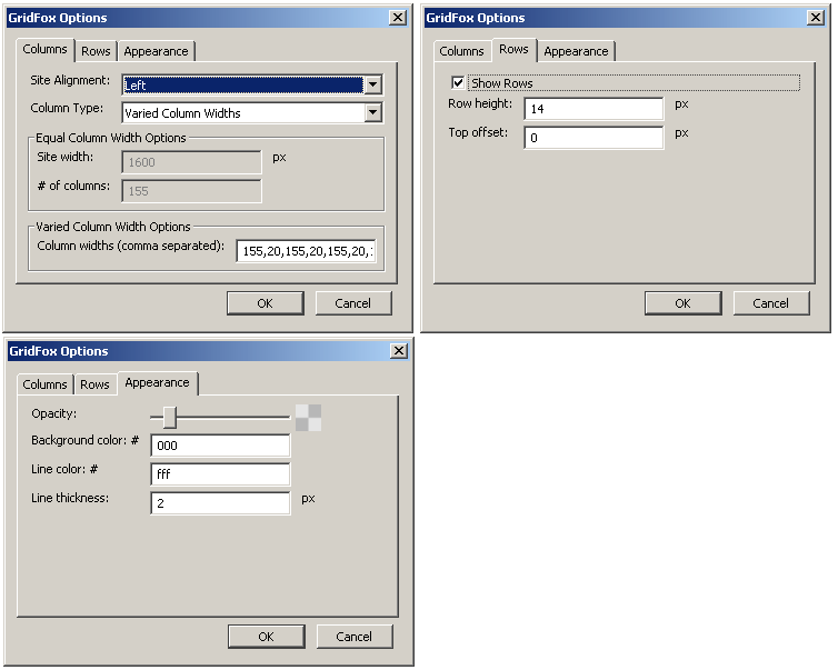
There is a nice FireFox extension for checking the grid called GridFox. The entire reporting tool UI team uses GridFox to make sure we stick to the grid. If you’re curious, this is our GridFox configuration:
Note the value for the column widths. This value is “155, 20” repeated about a dozen times. The number of times you need it depends on the width of your browser window. I know this is a little hacky, but GridFox doesn’t really support fluid grids.
The grid might seem a little restrictive, but it actually makes it easier to create new designs. The grid is our metronome. It helps us stay in rhythm, even when we’re improvising.
CSS blocking
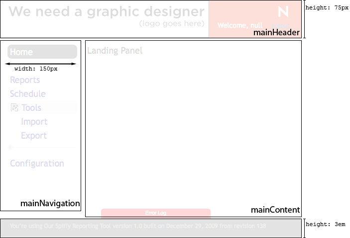
Now that we’ve looked at some of the general principles of the reporting tool UI let’s put them into action. The reporting tool follows a common UI pattern with a header, navigation bar, content area, and footer. These are all positioned out using CSS.

These basic blocks have some fixed dimensions, like the height of the header and footer or the width of the navigation bar, and many fluid dimensions. Most blocks grow to fill the browser window.
The blocks are also set up with a strong separation of layout. Our intention is that making changes to a single block should only affect that block. If you change the header layout you don’t want to accidentally break the footer.
Each block uses a different internal layout scheme.
- The header uses absolute positioning to set the logo, Novell logo, and actions blocks.
- The navigation bar uses list items and
divto provide a programmable tree menu structure. - The footer is just a string of text with some
spanelements for styling. - The main content areas use different layouts depending on which item is select in the navigation menu.
These blocks provide a framework we can build on. For example, the error log can align to the top of the footer and expand upward as needed.
CSS file structure
The styles for the reporting tool are defined in five different style sheets in a very specific order.
NovellGWTLib.css contains the styles for the shared GWT library project. It provides common widgets and utilities we use in the reporting tool.
base.css is where most of our CSS goes. It contains our cross-browser CSS. It also uses YUI 2: Reset CSS to get a standard starting point across all browsers.
edcal.css comes from an open source editorial calendar for WordPress. We are using this calendar for one of the panes in the reporting tool.
platform.css is actually served with a servlet. This servlet detects the user’s browser and returns a special stylesheet for just that browser. Right now it supports:
- FireFox 2.x
- FireFox 3.x
- Internet Explorer 7
- Internet Explorer 8
- Chrome 3
There are patterns to include browser-specific styles without using a servlet, but using a servlet gives us a clean and clear mechanism with a small number of HTTP requests. Most of these files contain only one or two style rules.
custom/custom.css doesn’t have anything in it yet. This is another servlet that serves the contents of a CSS files from outside of our WAR. Customers can edit this file to override any of our styles or completely customize the look and feel of the reporting tool. This is a big part of why we invest the time and effort to make the report tool CSS easy to use.
All five of these files are referenced in idmrpt.css. That file contains import statements for all the rest. This gives us a single place to reference all of the CSS files and keep them in order.
Is it worth it?
You might look at this and think we went overboard. Many people have created user interfaces with a lot less work. They don’t look as good, but does it matter?
We think UI matters. It changes the way people think about your products, how they use it, and ultimately how much they buy. Not convinced? Check out the story of the $300 Million Button. UI really matters.
In addition to making the UI better, this work also makes it more maintainable. Eliminating tables tags and keeping our HTML simple makes it possible for us to make quick changes. You can judge a system by how well it adapts to changes, and this system moves, grows, and adapts very well.
