I hardly ever hand people paper documents, but about a year ago two events happened in my life which caused me to think more about them. The first was reading The Elements of Typographic Style by Robert Bringhurst. The second was getting laid off. I started thinking about the one piece of paper every engineer prints out and hands to people, their resume.
Just for the record, I wasn’t actually laid off. My company hired me back in the nick of time.
Most resumes have terrible formatting and mine was no exception. I had always suspected this, but Mr. Bringhurst’s book gave me the information I needed to prove it. When trying to create a better resume the first step is to read The Elements of Typographic Style. I would recommend this book to anyone who ever writes just about anything. However, if you don’t want to read the book I’ll summarize some of the principles you need to know in order to make your resume look a lot better.
Let’s Talk Type
When thinking about resumes you need to focus on four primary areas of typography: fonts, style, size, and spacing.
Choosing the font
This blog is all about open source. I am a big believer in open source so I started by looking for an open source font. There are a few of them out there. Delicious by Jos Buivenga, the Liberation fonts from Red Hat, and BitStream’s Vera font family are all decent fonts. The most compelling one was Linux Libertine. It is an open source replacement for Times New Roman. It is a very good font with only one problem; it looks and behaves like Times New Roman.
Next I looked at some proprietary fonts starting with Times New Roman. Times New Roman is a digital rendition of the font used by a British newspaper in 1931. It just isn’t a very compelling font. Times New Roman is best at 12 point where its more rounded letter forms get the space they need. It isn’t as readable at smaller sizes. It also has some specific issues with kerning, the space between the letters. Times New Roman also lacks ligatures which means it doesn’t represent certain letter combinations properly.
I looked at the rest of the fonts that came with Windows and Linux. None of them were much better. Palatino was the leader, but it is takes more space than Times New Roman and doesn’t read any better at smaller sizes. In the end I chose FF Scala. FF Scala is the font used by Ellen Lupton in her excellent book Thinking With Type and in the latest versions of The Chicago Manual of Style. Scala is really gorgeous. It is also amazingly readable at 10 point. Scala is so great that I paid for it.
FF Scala is a neohumanist slab serif designed in 1990 by Martin Majoor. Humanist means that the font has variations in the line width of the letters similar to calligraphy. Slab serif refers to the block-like ends on the serifs of each letter. I’ll talk more about serifs later in this article. The combination of the humanist lines with the block-like serifs gives Scala a modern feel which works well for a programming resume.
I really wanted to find an open source font, but none of them were good enough. Open source software is very advanced, but open source typography is way behind commercial typography. This issue came up again when I was looking for the right tool to do the layout.

Ligatures
One other reason for buying a professional font is ligatures. Most of the fonts that come free with your computer do not include ligatures. Many fonts have a basic and a professional version. The basic version will rarely include ligatures. Ligatures are combinations of characters which are rendered specially. They make the letter combinations fit together and help the eye flow more easily over the letters.

Ligatures are a small detail, but they are crucial to the professional look of your resume. You may not notice them on a conscious level, but they help you read the word and focus on the meaning rather than the letters.
Serifs

I only considered fonts with serifs. Serifs are the small decorations in a letter which make it easier to visually distinguish one letter from another. Serif fonts should be used when you are working with larger blocks of text like in the body of a paragraph. There are a few sans-serif fonts, like Verdana, which are OK for larger chunks of text, but the general rule is to use serif fonts when working with larger sections of text.
The Page
Before you can consider font size you have to think about the page dimensions and layout. A resume must fit on one page because nobody will read the second page of your resume. It also must be a standard paper size and use portrait rather than landscape orientation. A resume is an inherently conservative document. This is the place to show how qualified you are, not how creative you can be with your layout. Good typography enhances the content without distracting from it.
Font size and spacing

To fit on one page I wanted to use the smallest font possible, but I had to make sure the font was readable. Scala is much more readable at 10 point than Times New Roman and it is only slightly wider.
For my resume I used 10 point Scala with 12 point spacing. The size refers to the height of each letter and the spacing refers to the height of each line. 10 point font with 12 point spacing is normally written as 10/12. This is a very common ratio in professional typography.
Title size
A page of text will often contain elements like pictures or titles which are a non-standard size. My resume has my name in a much larger font. When you add these non-standard elements you should make sure the lines of text are not pushed out of alignment. For example, if you put in a picture which is 32 points high in a 10/12 document then you should round up the vertical space you use for the image to 36 points so it is evenly divisible by 12. This will make sure that the text after the image lines up with the text from before the image.
For the big header in my resume I used 48pt Scala. This may seem quite large, but it works well since the resume is all about me. A resume is not the place to be shy. 48 point Scala works well because it is exactly four lines of 10/12 type. This makes everything line up perfectly.

With an understanding of these basic concepts I was ready to start working on the resume.
Where It All Started
click here
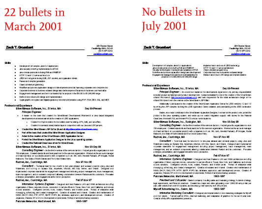
The oldest resume of mine I could find was from March 2001. This resume was typeset using Arial and, um… more Arial. It is longer than one page and it uses 22 bullets. The bullet point may be the most misused glyph in human history. An impressive feat since it didn’t come into popular use until the availability of Microsoft PowerPoint. Having a bullet in a list is rarely helpful, and having 22 of them in one page is way too much.
I got a little better in July of 2001 when I crammed this resume onto one page (almost). In order to get down to one page, this resume is crammed more tightly than a crowded tenement. This version also uses a lot of lines and other text decorations, but removes all 22 bullets. The July 2001 resume was my most recent resume when I started this process.
Page Layout
Resumes have a lot of rules they must follow. For example, they must fit in one page and they must be conservative in their nature. However, within those constraints there is an enormous opportunity for innovation. Microsoft Word has one thousand and one resume templates.
The choice of layout is all about the information you are providing. The layout is meant to guide the reader’s eye through the page along the path you want. Navigation elements are like street signs. The layout is the road your reader will travel.

Each section of the layout has a specific meaning and is meant to be looked at in a preset order. The reader starts with the title. This is important because the title is my name and once again, my resume is all about me. The eye should then travel right to the contact information. The reader may not read this information in depth, but they should see that it is there. Personal contact information makes the resume feel more real. Next the reader moves down to look at the technical skills, project skills, and resume body.
Technical skills
Technical skills are the specific technologies I am proficient in. This section lists programming languages, platforms, databases, and operating systems in order of importance based on the position I am applying for. This is not a complete list; it just includes the technologies that matter for the specific job I am applying for.
This section will help someone in the human resource department decide where my resume should go. It is mostly just a check-box list of single word items like Java, Python, and C++. Putting the word Java in this list doesn’t tell you if I am an expert or if I just learned it. It only tells you that I might be qualified for a position like Java Programmer.
The technical skills section may also be used by the interviewer when they ask more technical questions. The interviewer should feel comfortable asking me in-depth questions about every technology in this section, and I need to feel comfortable answering those questions.
Project skills
I am a skilled Java programmer, but that doesn’t tell you much about the types of projects I work on. It could mean that I am an individual contributor who can write simple UI, or that I am an experienced architect who can plan your new server product. The project skills section makes this clear. The purpose of this section is to help people figure out what level of engineer I am. For example, “Production level architecture and API design” will tell you that I can be responsible for designing an API suitable for release to your customers.
Project skills is also the place to highlight the technical skills that don’t fit well into one or two words. “Security infrastructure including authentication, access control, PKI, licensing, and steganography,” tells you that I am knowledgeable about security and cryptography much better than mentioning specific algorithms or protocols like RSA or AES.
Resume body
The resume body is where the reader can find out what I have actually done in my previous jobs. This section contains strong verb statements like, “Worked extensively on the J2EE-certified Novell Application Server.” Action oriented verbs like “worked”, are a good way to show that you are focused on results.
It also uses descriptions like, “Architect and primary developer for…” As a software engineer what I did can be directly linked to the software I made. I only need to describe what I worked on and make it clear what my role in the project was.
My resume body contains nothing but plain text. There are no titles, headers, text decorations, or bullet points. The four jobs listed in this section are only separated by an extra new line. The reader can read this section like a book and find out about my career. The navigation section will help them separate one job from another.
It is also important to note that the resume body is justified. This section should read more like prose. It makes the page balance better if it is not ragged-right. See the examples below.
Navigation
The left side is dedicated to navigation. This section will help the reader move between the different parts of the page. The navigation section contains four pieces of information: the section titles (set in Scala small caps), the job titles (set in Scala bold), the company name (set in Scala regular), and the dates I held each position (also set in Scala regular). This information is not what the reader is most interested in. An interviewer does want to know what companies I have worked for, but they are more interested in what I did there. Working for Google won’t help you get a programming position if your job title was “cafeteria worker.”
References
The last section is references. Resume references are a hold-over from a time when your references said a lot about your social class. Today references are normally left off your resume and it is assumed that you will have them available when asked. However, I’m a bit old-fashioned so I included the references section. It simply reads, “References available upon request.” It is set in Scala small caps.
A few notes about spacing
One of the many important lessons I learned from The Elements of Typographic Style was how to think about white space. The space on the page is not the absence of a thing, but a thing in and of itself. The white space of your page will create a page balance and help the reader navigate the page. This layout has a large amount of white space and still leaves enough room for a generous amount of text.
The Tools
Now that I had a basic idea of the layout I wanted the next step was to find the right tool to make it happen. I started with OpenOffice Writer, but I quickly abandoned it. OpenOffice Writer (just like Microsoft Word) is a word processor. It is a fine tool for writing small papers and business letters, but it doesn’t give you as much control over the layout as I needed. It also gives you almost no control over the text spacing. I needed desktop publishing software.
Scribus
Source File
The first tool I tried was Scribus. Scribus is a powerful desktop publishing tool available for Windows, Mac OSX, and Linux. It is also open source and free. Scribus handled about 90 percent of what I needed.

Scribus fell short in a few key areas. Its justification engine isn’t great. It only support justification by adding or reducing the space between words inead of the space between letters. This meant I couldn’t make the resume body justified without some strange letter spacing. It also had some kerning issues with the title font which required me to change the letter spacing by hand.
The other big issue is the support of OpenType fonts. When you buy a font it will come in one of two formats: OpenType and TrueType. TrueType is an older format and it normally contains one glyph for each letter. The OpenType fonts may contain multiple glyphs for many letters. For example, Scala has over a dozen variations of the numeral two.
Scribus can not embed OpenType fonts into PDF files correctly, so it creates a vectorized outline of each character. The PDF resume I generated from Scribus is over 200 KB (compared with 44 KB from Adobe InDesign). When you view the resume in the PDF reader, you cannot select the text.
Adobe InDesign
Source File
The next tool I tried was Adobe InDesign. Unlike Scribus, InDesign is proprietary software and it costs $700. But it is a far superior tool. The accomplishments of the Scribus team are very impressive, but they have a long way to go before they catch up with InDesign.
InDesign uses the outstanding Herman Zapf justification engine. This algorithm look at every line in the paragraph to decide where to use hyphens. It controls word spacing, letter spacing, character width, and hyphenation. The Zapf justification engine will actually make individual characters wider and skinnier to make the line the correct width. The results are breathtaking.
InDesign also fully supports OpenType fonts and generates them properly into PDF files. The PDF resume I generated from InDesign was only 44KB and rendered each character so it could be selected as text.
I really like to use open source software, but InDesign was the clear winner. Only the $700 price tag has prevented me from purchasing it. I used the 30-day evaluation copy. Only time will tell if my love of this tool will overcome my sticker shock.
Putting It All Together
finished resume
Now that I had the layout I liked and the tools to make it happen, it was just a matter of putting it all together. The first step was to finalize the text.
Writing and editing
When I write a blog post like this one I know there will be typos and grammatical errors. I read every post and have someone else edit too, but typos are unavoidable. For a resume you really can’t afford any errors. The resume is only one page and it should be perfect.
I really can’t do that alone. I had my wife, my parents, and a friend read over my resume for me. I took all of their comments and then I made my wife read it again.
The final result

Conclusion
It is now many hours and over $100 later, but I have a decent resume. Was it worth the extra effort? Maybe. Taking the time to properly format your resume will make it look better, but it won’t get you a job ahead of someone who is much more qualified than you are. However, people who don’t know anything about typography like my resume better than what comes out of Microsoft Word. You have to decide for yourself if it is worth the time and money.
Something is missing
The title in my resume is 48 point Scala. The serifs on a font like Scala make body text more readable, but they are distracting for larger font sizes and titles. Many designers use a combination of serif and sans-serif fonts. Times New Roman and Arial is a popular choice.
Scala has a companion font named Scala Sans. Scala Sans is closely related to Scala, but without the serifs. Ideally the title of my resume should be set in Scala Sans. However, my 30-day evaluation of InDesign has expired and Scala Sans costs $44. It didn’t seem worth $44 to make the title Scala Sans.
Update: Since writing this article I purchased a copy of InDesign and Scala Sans for use with another project. I used them to create a new resume and update the article. Scribus is a great project, but Adobe InDesign is amazing. As are the results.
A note about licensing
The text in this article, like the rest of this blog, is released under the Creative Commons Attribution-Share Alike 3.0 license. This license requires that you give me proper author attribution when using this text. For any text or materials you want to use in your own resume the attribution portion of this license is suspended. You can use anything in this article in your resume without attribution.
Acknowledgments
I want to take a moment to thank the Miss Tiffany and timd from the Typophile forums for help critiquing and improving the typography in this article.
Other Resources
If you work on an open source project you should check out What to Include in Your Open Source Resume by Esther Schindler. It also has some great quotes from me.
I’ve also written a new shorter article about why I put C++ in my resume and not CSS and how your resume brands you.